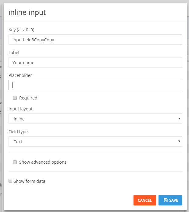
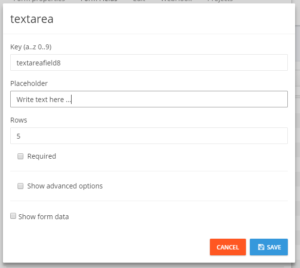
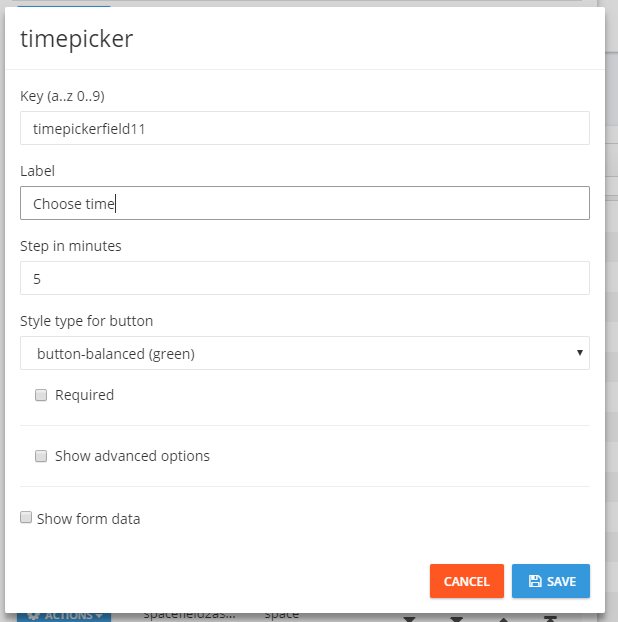
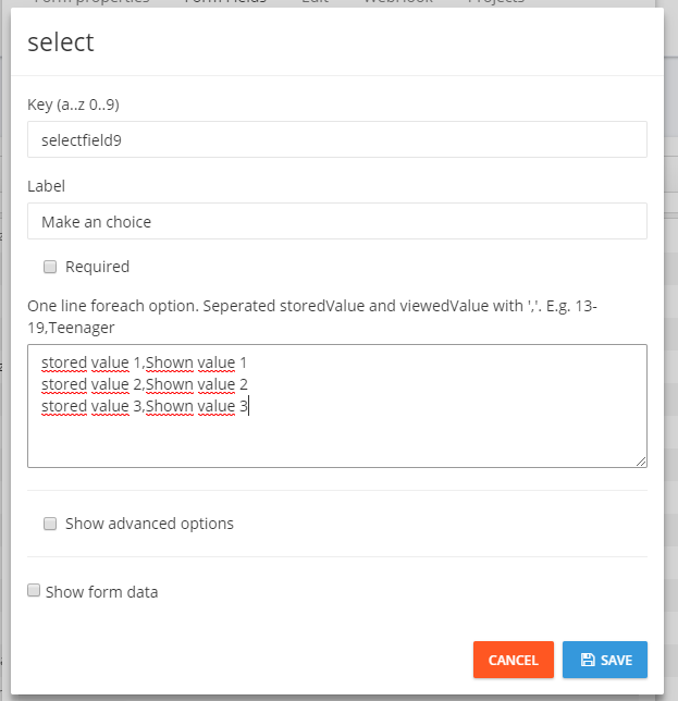
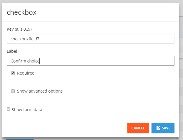
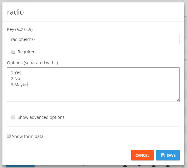
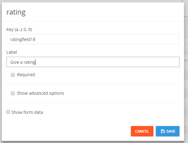
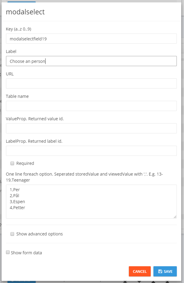
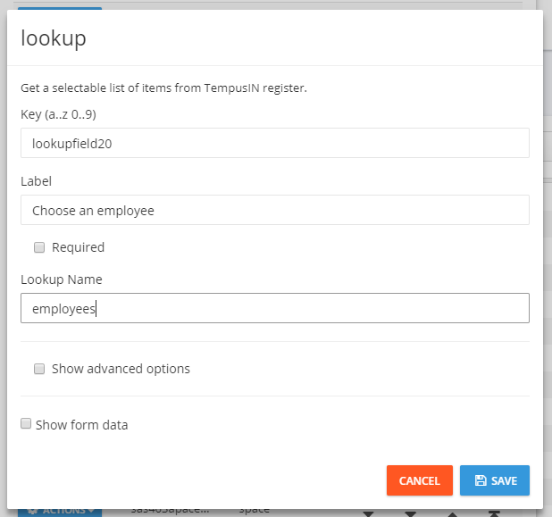
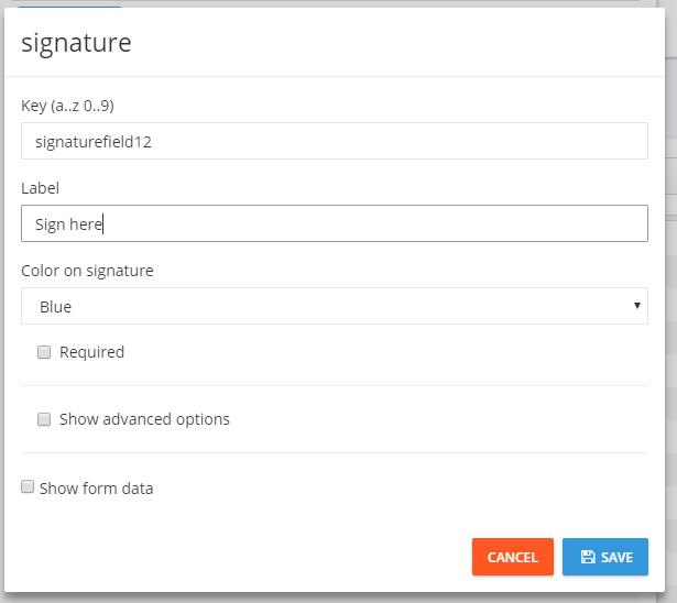
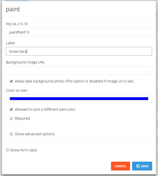
You find the field types by clicking on ADD FIELD when you are in the fan Form Fields under form edit.
Note
The looks of the fields in the app may vary depending on which type of device you are using.
Static fields
Fields that are used to give information to the user or beautify the form.
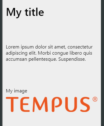
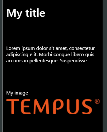
Underneath, from top to bottom, is examples for title, text and image (and the use of space divider between them):

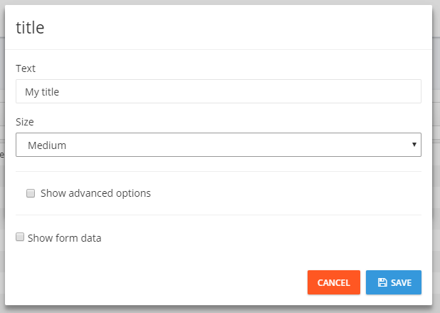
Title
Title field that shows an predefined title:

| Name |
Explanation |
Text |
Text that is shown. |
Size |
Size of the title: Large, Medium, Small. |
Show advanced options |
See below |
| Advanced options |
Explanation |
Hide expression |
Expression that is used to determine if the field should be hidden or not |
Hide field from start |
Hides the field from start. Will not be shown without an hide expression |
CSS classes |
See CSS classes |
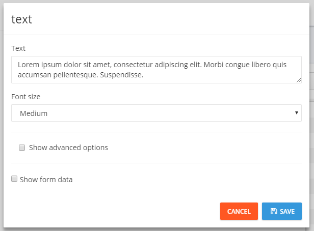
Text
Text field that shows an predefined text:

| Name |
Explanation |
Text |
Text that is shown. |
Font size |
Size of the text: Large, Medium, Small. |
Show advanced options |
See below |
| Advanced options |
Explanation |
Markdown |
Possibility to write text using Markdown.
Note: If you use Markdown, then Text and Font size isn't used |
Hide expression |
Expression that is used to determine if the field should be hidden or not |
Hide field from start |
Hides the field from start. Will not be shown without an hide expression |
CSS classes |
See CSS classes |
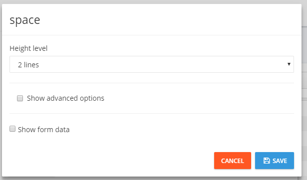
Space divider
Used to get space between the fields. Gives up to 3 blank lines.

| Name |
Explanation |
Height level |
Number of blank lines: 1 line, 2 lines, 3 lines |
Show advanced options |
See below |
| Advanced options |
Explanation |
Color of line |
Makes an line with the color you choose |
Type of line |
The type of line, dotted or solid |
Thickness of line |
How thick the line should be |
Image
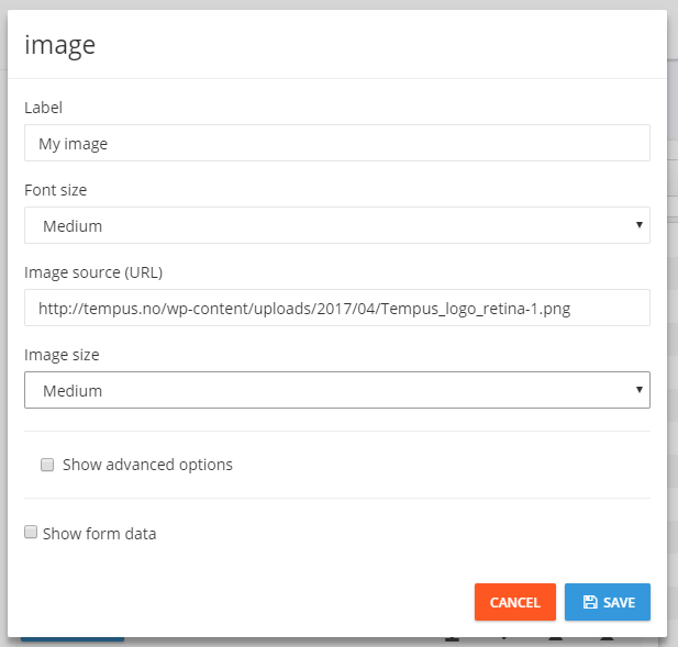
Used to display an image in the form:

| Name |
Explanation |
label |
Text that is shown over the image |
Font size |
Size of the text: Large, Medium, Small |
Image source (url) |
URL to the image that is shown |
Image size |
Size of the image: Large, Medium, Small |
Show advanced options |
See below |
| Advanced options |
Explanation |
Hide expression |
Expression that is used to determine if the field should be hidden or not |
Hide field from start |
Hides the field from start. Will not be shown without an hide expression |
CSS classes |
See CSS classes |
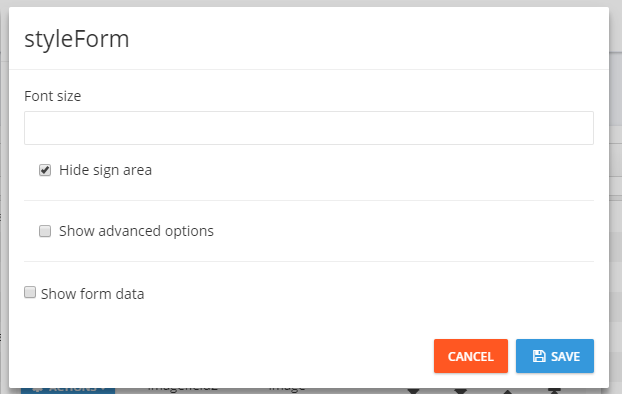
Used to change the look of the form:

| Name |
Explanation |
Font size |
Font size |
Hide sign area |
Removes the signed and ok in the bottom of the form for delivery. Used when Button is used for delivery. |
Show advanced options |
See below |
| Advanced options |
Explanation |
Background color |
Background color of the form |
Font color |
Font color of the form. You can either enter an color or as an RGB color code |
Custom CSS |
Custom CSS.
Note: Don't use this if you don't have knowledge of CSS. |
Example of another look using style form:

Text/time inputs
Used to get information from the user.
Used to get text input from the user:

| Name |
Explanation |
Key |
Unique ID for the field. Can only use letters and numbers |
label |
Text that shall give an explanation |
Placeholder |
Text that is shown in the field until the user starts typing |
Required |
If the user is required to fill in this field |
Input layout |
See separate table |
Field type |
See separate table |
Show advanced options |
See separate table |
| Input layout |
Explanation |
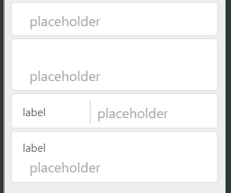
input |
No label. Only an input field |
floating-input |
When you click/type in the field, the lable is put over the input field |
inline-input |
Label on the left, input on the right |
stacked-input |
Label on top and input below. |
| Field type |
Explanation |
Text |
Normal keyboard |
Email |
Keyboard with buttons as @ and .com. |
Telephone |
Telephone keyboard |
Number |
Numerical keyboard |
Date |
Gives an popup calendar for choosing date |
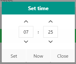
Time |
Gives an popup for choosing time |
DateTime |
Gives an popup for choosing date and time |
| Advanced options |
Explanation |
Hide expression |
Expression that is used to determine if the field should be hidden or not |
Hide field from start |
Hides the field from start. Will not be shown without an hide expression |
Keep value |
The field starts with the value the user last entered |
CSS classes |
See CSS classes |
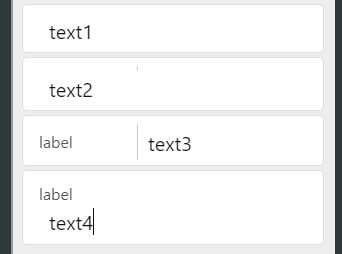
Example on the different inputs. From top to bottom: input, floating-input, inline-input and stacked-input:
| Before typing text |
After typing text |
 |
 |
TextArea
Larger text area for text input:

| Name |
Explanation |
Key |
Unique ID for the field. Can only use letters and numbers |
Placeholder |
Text that is shown in the field until the user starts typing |
Rows |
Number of rows in the text area |
Required |
If the user is required to fill in this field |
Show advanced options |
See below |
| Advanced options |
Explanation |
Hide expression |
Expression that is used to determine if the field should be hidden or not |
Hide field from start |
Hides the field from start. Will not be shown without an hide expression |
Keep value |
The field starts with the value the user last entered |
CSS classes |
See CSS classes |
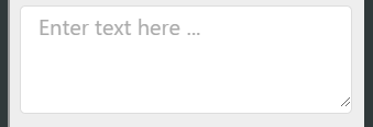
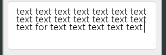
Example of an text area:
| Before typing text |
After typing text |
 |
 |
Time picker
Makes an button for picking the time.

| Name |
Explanation |
Key |
Unique ID for the field. Can only use letters and numbers |
label |
Text that shall give an explanation |
Step in minutes |
How large steps the picker makes when choosing minutes |
Style type for button |
Gives an set of alternatives for the color of the button |
Required |
If the user is required to fill in this field |
Show advanced options |
See below |
| Advanced options |
Explanation |
Hide expression |
Expression that is used to determine if the field should be hidden or not |
Hide field from start |
Hides the field from start. Will not be shown without an hide expression |
Keep value |
The field starts with the value the user last entered |
CSS classes |
See CSS classes |
Example of an time picker:
| Before choice |
Choose time |
After choice |
 |
 |
 |
Select list
Used to make an dropdown menu where the user chooses an element. The elements is entered line by line, where the stored value is before the comma and the shown value is after the comma.

| Name |
Explanation |
Key |
Unique ID for the field. Can only use letters and numbers |
label |
Text that shall give an explanation |
historyselect |
Have the latest chosen options in the top of the list |
Required |
If the user is required to fill in this field |
Options |
Enter the elements on the format (line by line): stored value,shown value |
Show advanced options |
See below |
| Advanced options |
Explanation |
Hide expression |
Expression that is used to determine if the field should be hidden or not |
Hide field from start |
Hides the field from start. Will not be shown without an hide expression |
Keep value |
The field starts with the value the user last entered |
CSS classes |
See CSS classes |
Example of an select list:
| Before |
After choice |
 |
 |
Checkbox
A checkbox to confirm a choice.

| Name |
Explanation |
Key |
Unique ID for the field. Can only use letters and numbers |
label |
Text that shall give an explanation |
Required |
If the user is required to fill in this field |
Show advanced options |
See below |
| Advanced options |
Explanation |
Hide expression |
Expression that is used to determine if the field should be hidden or not |
Hide field from start |
Hides the field from start. Will not be shown without an hide expression |
Keep value |
The field starts with the value the user last entered |
CSS classes |
See CSS classes |
Example of an checkbox:
| Before checking |
After checking |
 |
 |
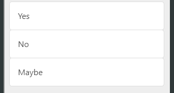
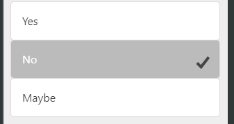
Used to create an field with buttons where the user can only choose one of them. The elements is entered line by line, where the stored value is before the comma and the shown value is after the comma.

| Name |
Explanation |
Key |
Unique ID for the field. Can only use letters and numbers |
Required |
If the user is required to fill in this field |
Options |
Enter the elements on the format (line by line): stored value,shown value |
Show advanced options |
See below |
| Advanced options |
Explanation |
Hide expression |
Expression that is used to determine if the field should be hidden or not |
Hide field from start |
Hides the field from start. Will not be shown without an hide expression |
Keep value |
The field starts with the value the user last entered |
CSS classes |
See CSS classes |
Example of radio button:
| Before choice |
After choice |
 |
 |
Rating
Gives the user the user the possibility to give an rating 1-5:

| Name |
Explanation |
Key |
Unique ID for the field. Can only use letters and numbers |
label |
Text that shall give an explanation |
Required |
If the user is required to fill in this field |
Show advanced options |
See below |
| Advanced options |
Explanation |
Hide expression |
Expression that is used to determine if the field should be hidden or not |
Hide field from start |
Hides the field from start. Will not be shown without an hide expression |
Active icon |
The icon(s) that is chosen/active
Icons can be found here (use the "Name" column) |
Non-active icon |
The icon(s) that is not chosen/active |
Color of active icon |
The color of the active icon(s) |
Color of non-active icon |
The color the non-active icon(s) |
Keep value |
The field starts with the value the user last entered |
CSS classes |
See CSS classes |
Example of rating:
| Before choice |
After choice |
 |
 |
Search list
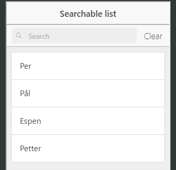
Makes an searchable list. Can be made in 3 ways:
- A local list in the same way as Select list
- Get values from an table in Tempus IN (see Lookups)
- Get values from an external source through an API call.

| Name |
Explanation |
Key |
Unique ID for the field. Can only use letters and numbers |
label |
Text that shall give an explanation |
URL |
URL to the API, if the values should be collected externally |
Table name |
Name of table in Tempus IN, if the vales should be collected from there |
ValueProp |
If using external API or Tempus IN table: The ID of the values that should be stored |
LabelProp |
If using external API or Tempus IN table: The ID of the values that should be shown |
Options |
For local list: Enter the elements on the format (line by line): stored value,shown value |
Required |
If the user is required to fill in this field |
Show advanced options |
See below |
| Advanced options |
Explanation |
Hide expression |
Expression that is used to determine if the field should be hidden or not |
Hide field from start |
Hides the field from start. Will not be shown without an hide expression |
Update when .. |
Update the field when one of these fields changes
Given on the form model.key, divided by , |
Path to data |
Path to where the data is in the returned object |
Keep value |
The field starts with the value the user last entered |
CSS classes |
See CSS classes |
Example of search list:
| Before choice |
Choice |
After choice |
 |
 |
 |
Lookup
Gets values from an Tempus IN table (see Lookups) that can be selected:

| Name |
Explanation |
Key |
Unique ID for the field. Can only use letters and numbers |
label |
Text that shall give an explanation |
LookupName |
Name of table in Tempus IN where the values should be collected
Note: It's important that the table is in the same project as the form |
Show advanced options |
See below |
| Advanced options |
Explanation |
Hide expression |
Expression that is used to determine if the field should be hidden or not |
Hide field from start |
Hides the field from start. Will not be shown without an hide expression |
Keep value |
The field starts with the value the user last entered |
CSS classes |
See CSS classes |
Example of lookup:
| Before choice |
After choice |
 |
 |
Signature
Makes an signature field

| Name |
Explanation |
Key |
Unique ID for the field. Can only use letters and numbers |
label |
Text that shall give an explanation |
Color on signature |
Color of the signature: Black, Blue, Red. |
Required |
If the user is required to fill in this field |
Show advanced options |
See below |
| Advanced options |
Explanation |
Hide expression |
Expression that is used to determine if the field should be hidden or not |
Hide field from start |
Hides the field from start. Will not be shown without an hide expression |
CSS classes |
See CSS classes |
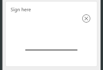
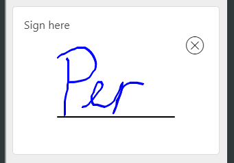
Example of signature:
| Before signing |
After signig |
 |
 |
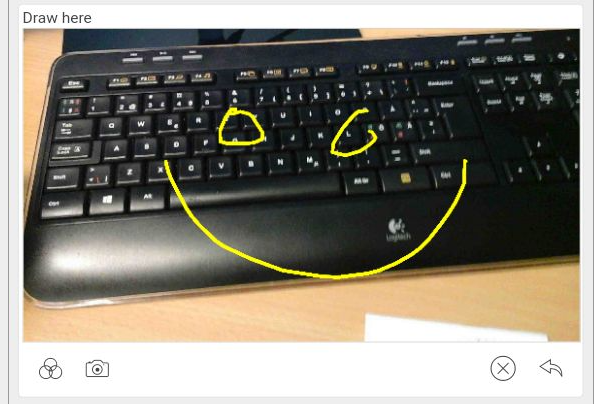
Paint
Gives an drawing field.

| Name |
Explanation |
Key |
Unique ID for the field. Can only use letters and numbers |
label |
Text that shall give an explanation |
Background image URL |
The option to give an predifined background image to draw on |
Allow take background photo |
Allow the user to take an picture to draw on |
Color on pen |
Color of the pen: Black, Blue, Green, Red. |
Allowed to pick a different pen-color |
Allow the user to change the pen color |
Required |
If the user is required to fill in this field |
Show advanced options |
See below |
| Advanced options |
Explanation |
Hide expression |
Expression that is used to determine if the field should be hidden or not |
Hide field from start |
Hides the field from start. Will not be shown without an hide expression |
CSS classes |
See CSS classes |
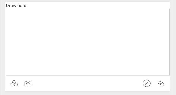
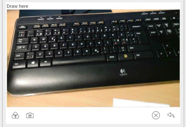
Example paint:
| Before drawing/picture |
After picture |
After drawing |
 |
 |
 |
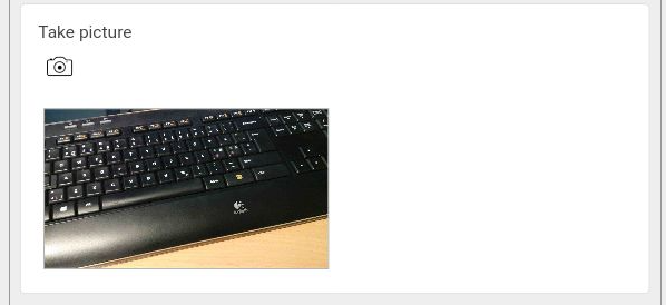
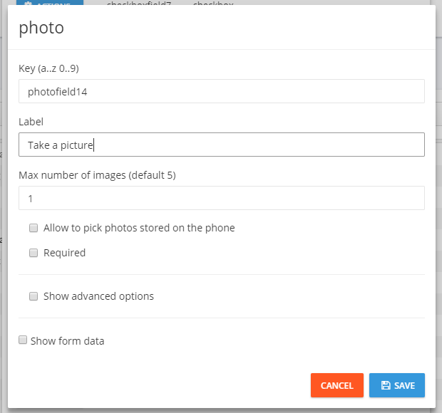
Photo
Let the user take one (or more) picture(s) that is stored in the form.

| Name |
Explanation |
Key |
Unique ID for the field. Can only use letters and numbers |
label |
Text that shall give an explanation |
Max number of images |
Maximum number of pictures the user may take |
Allow to pick ... |
Allow the user to pick photos stored locally on the phone |
Required |
If the user is required to fill in this field |
Show advanced options |
See below |
| Advanced options |
Explanation |
Hide expression |
Expression that is used to determine if the field should be hidden or not |
Hide field from start |
Hides the field from start. Will not be shown without an hide expression |
CSS classes |
See CSS classes |
Example of photo:
| Before picture |
After picture |
 |
 |
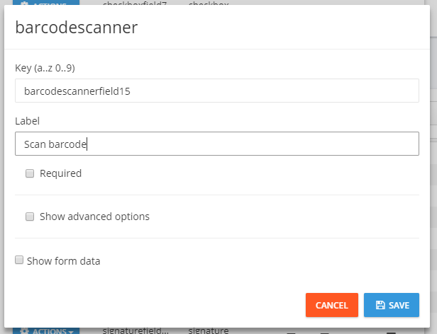
Barcode Scanner
Let the user scan an barcode

| Name |
Explanation |
Key |
Unique ID for the field. Can only use letters and numbers |
label |
Text that shall give an explanation |
Required |
If the user is required to fill in this field |
Show advanced options |
See below |
| Advanced options |
Explanation |
Hide expression |
Expression that is used to determine if the field should be hidden or not |
Hide field from start |
Hides the field from start. Will not be shown without an hide expression |
Enable multiscan |
Enables multiscan. It entails that the user may scan several barcodes that is stored in an list with (optional) additional information from an popup |
Text of popup |
The text that is in the popup that asks for additional info. Leave blank for no popup |
Type of input |
The type of the additional information |
Keep value |
The field starts with the value the user last entered |
CSS classes |
See CSS classes |
Example of barcode scanner:
| Before scan |
After scan |
 |
 |
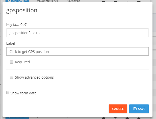
Position
Let the user get his GPS position

| Name |
Explanation |
Key |
Unique ID for the field. Can only use letters and numbers |
label |
Text that shall give an explanation |
Required |
If the user is required to fill in this field |
Show advanced options |
See below |
| Advanced options |
Explanation |
Hide expression |
Expression that is used to determine if the field should be hidden or not |
Hide field from start |
Hides the field from start. Will not be shown without an hide expression |
Divider |
Fill inn to change the divider between latitude and longitude (default: ,) |
Automatically get ... |
Gets the position automatically when the form opens |
Keep value |
The field starts with the value the user last entered |
CSS classes |
See CSS classes |
Example of position:
| Before gps |
After gps |
 |
 |
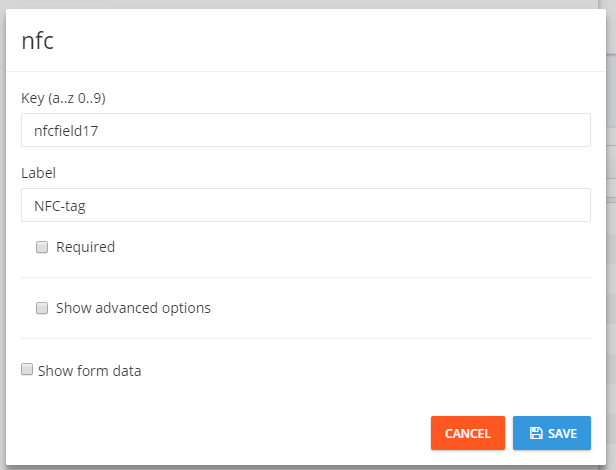
NFCtag reader
Used to scan an NFC-tag. Activated by clicking on the shown icon.

| Name |
Explanation |
Key |
Unique ID for the field. Can only use letters and numbers |
label |
Text that shall give an explanation |
Required |
If the user is required to fill in this field |
Show advanced options |
See below |
| Advanced options |
Explanation |
Hide expression |
Expression that is used to determine if the field should be hidden or not |
Hide field from start |
Hides the field from start. Will not be shown without an hide expression |
Always active |
If chosen, the NFC scanner will always be active |
Disable manual input |
If chosen, the user can't enter text in the field using the keyboard |
Keep value |
The field starts with the value the user last entered |
CSS classes |
See CSS classes |
Example of NFC-tag reader:
| Before scan |
After scan |
 |
 |
API-fields
Fields for getting/sending information from/to other sources.
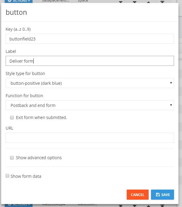
Makes an button that delivers the form as well as sending data to an API.

| Name |
Explanation |
Key |
Unique ID for the field. Can only use letters and numbers |
label |
Text that shall give an explanation |
Style type for button |
Gives an set of options for color for the button |
Function for button |
See separate table |
Exit form when submitted |
Exits the form when the button is clicked.
Note: If the function is Postback, it will exit anyway |
URL |
Lenke/URL til APIet som dataen skal sendes til |
Show advanced options |
See separate table |
| Function for button |
Explanation |
Postback and end form |
Delivers the form, sends data to an API and then exits the form |
Get information |
Sends in data and gets an response. Used together with servermessage in editor |
Register new values and keep form |
Sends data to API and Tempus IN, but stays in the form. Gives an popup as response |
Temporary store the form |
Temporary storage. Sends in the form, but doesn't register it as delivered. The user gets the same values the next time he opens the form |
| Advanced options |
Explanation |
Hide expression |
Expression that is used to determine if the field should be hidden or not |
Hide field from start |
Hides the field from start. Will not be shown without an hide expression |
Keep value |
The field starts with the value the user last entered |
CSS classes |
See CSS classes |
Example of button:

webLookup
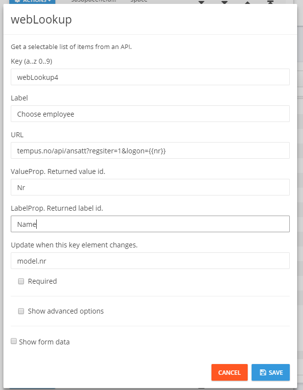
Gets choices from an API. Data to the API is sent in the URL:

| Name |
Explanation |
Key |
Unique ID for the field. Can only use letters and numbers |
label |
Text that shall give an explanation |
URL |
URL to the API. Data to the API is sent here. Use the key om double braces ({{ansattNr}}) |
ValueProp |
ID of the value that is stored |
LabelProp |
ID of the value that is shown |
Update when ... |
Key, with model. first, to the element that shall trigger a new collect of data when it's changed, e.g. model.ansattNr |
Required |
If the user is required to fill in this field |
Show advanced options |
See below |
| Advanced options |
Explanation |
Hide expression |
Expression that is used to determine if the field should be hidden or not |
Hide field from start |
Hides the field from start. Will not be shown without an hide expression |
Path to data |
Path to where the data is in the returned object |
Keep value |
The field starts with the value the user last entered |
CSS classes |
See CSS classes |
infoLookup
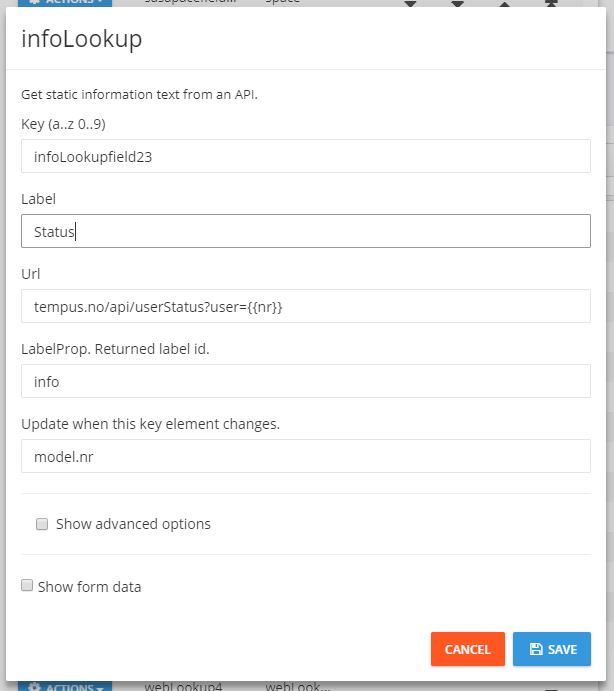
Gets information from an API:

| Name |
Explanation |
Key |
Unique ID for the field. Can only use letters and numbers |
label |
Text that shall give an explanation |
Url |
URL to the API. Data to the API is sent here. Use the key om double braces ({{userNr}}) |
LabelProp |
ID of the value that is shown |
Update when ... |
Key, with model. first, to the element that shall trigger a new collect of data when it's changed, e.g. model.userNr |
Show advanced options |
See below |
| Advanced options |
Explanation |
Hide expression |
Expression that is used to determine if the field should be hidden or not |
Hide field from start |
Hides the field from start. Will not be shown without an hide expression |
Text to show ... |
If it isn't returned an valid object, then this text is shown |
Path to data |
Path to where the data is in the returned object |
Markdown template |
Markdown template for showing the data
Note: If this is used, then labelProp isn't used |
Keep value |
The field starts with the value the user last entered |
CSS classes |
See CSS classes |
SearchLookup
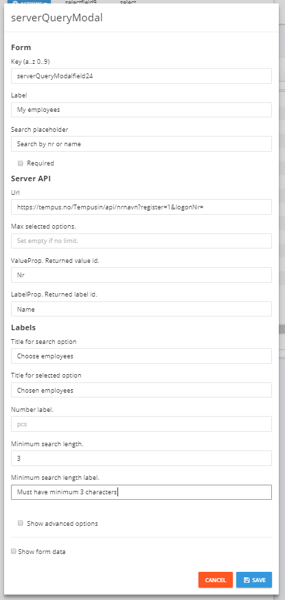
Does an direct search against server. Gets names of earlier stored values from server.

| Name |
Explanation |
Key |
Unique ID for the field. Can only use letters and numbers |
label |
Text that shall give an explanation |
Search placeholder |
Gives the user an explanation for what to search for |
Required |
If the user is required to fill in this field |
Url |
URL to the API |
Max selected options |
Maximum number of elements that can be chosen. For unlimited: don't enter an value |
ValueProp |
ID of the value that is stored |
LabelProp |
ID of the value that is shown |
Title for search option |
Title of the list of hits on the search that can be chosen |
Title for selected option |
Title of the list of chosen elements |
Number Label |
The label of number. When it's multi choice: # + nrlabel (e.g. 3 pieces) |
Minimum search length |
Number of characters the user must enter before it searches |
Minimum search length label |
Gives the user an explanation of how many characters that is neeeded |
Show advanced options |
See below |
| Advanced options |
Explanation |
Hide expression |
Expression that is used to determine if the field should be hidden or not |
Hide field from start |
Hides the field from start. Will not be shown without an hide expression |
Keep value |
The field starts with the value the user last entered |
CSS classes |
See CSS classes |
(This documentation page was last updated on 27.08.2018)
